10 Nonprofit Website Best Practices
These 10 nonprofit website best practices are our guiding principles for creating successful nonprofit websites and working with our nonprofit inbound marketing clients to monitor and improve the results by optimizing their websites for high performance.
These best practices are informed and validated by HubSpot’s advice on how to create a great website user experience.
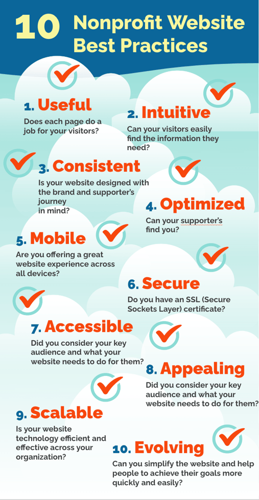
The best nonprofit websites are:
1. Useful
A website is useful if it helps visitors achieve their goals; if that doesn't happen, they’ll leave just as quickly as they came. Each page must do a job for your visitors. If you focus on your visitors with valuable and educational content for them, you'll be well on your way to achieving your goals for your website.
Before you can engage your visitors, you need to really know them! Document your best supporters, donors, or members so you can avoid short‑sighted decisions. Your web design process will then be more logical and effective.
Keep your visitors at the center of the experience by using key personas: semi‑fictional representations of your organization's ideal advocates, donors, volunteers, and other stakeholders.
Personas are based on market research and real data about existing supporters. The data should include your advocates' demographics, attitudes, challenges, goals, motivations, and objections. You can download a free template for creating nonprofit personas here.
Once you know who you're trying to reach, begin to develop useful content for them based on your organization’s key message platform and the supporter’s journey. The first step in content development is to make sure your brand messaging and persona profiles are ready for everyone involved in planning and creating a new website.
Above all, content needs to be structured to meet the needs and problems of your supporter personas. This strategy will ensure that your website clearly and consistently communicates what it needs to and that it gets to the right audience.
2. Intuitive
Help your visitors easily find the information they need by creating clear navigation menus that are based on the logical journey they will take to get involved with your organization and its mission. Plan your website so that visitors can find answers to their questions and know how to take action.
Providing too much information or asking too much of your visitors will create barriers and cause friction—and it may result in a low-performing website with a high bounce rate.
Create a simplified experience. Each page should answer one question at a time. This means using one key phrase per page and focusing on creating valuable and useful content around that topic. Only ask visitors to take one action at a time. What do people need to know on this page, and what do you want them to do once they know it?
Your site outline will evolve with your buyer personas' goals and motivations. Building on this foundation eliminates second-guessing throughout the development and design process.
3. Consistent
Your website is the most important asset for your brand, marketing, fundraising, development, and sales. It's the central expression of your organization’s goals and mission. When the website experience is consistent with the organization's brand and mission, that consistency creates trust.
One way to create consistency is to develop the website around your key message platform and visual style guide. These tools help you to line up all your messaging and visual elements, creating a cohesive experience for visitors.
4. Optimized
Search engine optimization is the process of making sure both front- and back-end elements of your website rank well in search engines so that visitors find it. One type of SEO is “on-page” SEO—optimizations made right on the content of your page that can be seen by search engines and visitors alike.
On-page SEO includes a meta description, link text, content, images, and snippets right on your pages. Together, these help search engine crawlers (or spiders or bots) to understand what each page of your site is about, so they can do the job of matching as closely as possible to people’s search queries.
Search engines are hyper-focused on intent and relevance. They are updating algorithms based on the questions users are asking and making sure they deliver specific, relevant results that meet the user’s intent.
Less-visible settings important to optimizing your website for search are off-page and technical SEO. It’s critical to consider all the components of SEO if you want a high-performing website.

5. Mobile
With so many people surfing the web on the go, it is important to optimize the user experience for mobile devices such as cell phones and tablets. If you don’t, you could miss out on traffic and leads for your organization.
Because we now browse and search the web so much from devices other than desktop computers, offering a great website experience across devices is a top priority. Google is in the process of transitioning their algorithms for websites to mobile-first indexing instead of desktop crawling. Soon, Google will exclusively use the mobile version of sites’ content for ranking.
Google provides the best practices to make sure our websites are mobile-friendly, including a tool to test how the site is performing across devices. You can leverage Search Console to run inspections, find crawling errors, and capture other performance metrics.
A responsive design is the best practice for ensuring that a website is optimized for mobile views. Responsive design is a way of coding web pages that respond to the device screen size detected in each session. With responsive website design, the website layout reformats the web page for the device being used.
6. Secure
Search engines now prioritize users’ cybersecurity. A website without an SSL certificate will show a visitor a stern warning about the lack of security on the domain. Without a private connection, most visitors will quickly navigate away, so you could be losing traffic, leads, and revenue without this essential optimization.
You'll notice that URLs either start with "http" or "https.” The “s” means the connection to that website is secure and encrypted. The standard technologies that power this are SSL (Secure Sockets Layer) and TLS (Transport Layer Security).
With most open-source content management systems, you'll need to purchase an SSL certificate to connect to your website's domain. With professional CMS platforms such as HubSpot, all files are automatically encrypted with SSL. With the HubSpot CMS Hub, you can direct all visitors to the secure version of your site—no plug-ins required.
To check how your website measures up in terms of SEO and page performance, you can use a free website grader here.
7. Accessible
Your organization demonstrates empathy by making your content available and accessible to all visitors, especially those with differing abilities. Refer back to your personas to make sure you are being inclusive of all needs for your website.
The Web Content Accessibility Guidelines (WCAG) explain the standards for establishing accessibility on the web. When planning with your web team about accessibility, familiarize yourself with different levels of accessibility. This overview of WCAG 2 explains how to make web content more accessible to people with disabilities.
8. Appealing and Approachable
You might look to other websites for inspiration. Keep in mind as you do that high-end visuals and features can be deceiving. Some sites may look impressive, but are they creating engaging and useful experiences for their audiences?
Ground yourself back in your organization's ideal personas. What does your website need to do for them? Keep it simple; you can always build on the most important elements as you optimize your website asset going forward.
When it comes to an approachable website, less is more. Use plenty of white space, and keep each page’s focus on a single topic or goal. Add visual elements only when they are consistent with the brand and persona characteristics and in support of the visitors' journey.
9. Scalable and Customized
The organization's website is the most important digital marketing asset. It needs to function across teams and accommodate the growth of the organization.
Make sure your website technology is efficient and streamlined across your organization. Beware of “free” CMS software, like WordPress, that is billed as “free” but requires maintenance, updates, and triage to function properly on an ongoing basis.
Most free content management systems aren't built for marketing. Most organizations that use them for that purpose end up having to cobble together many different solutions that make it more difficult to carry out marketing and sales.
A professional CMS, such as HubSpot CMS Hub, is built to work seamlessly with other marketing activities and allows the organization to focus on strategy rather than on the security, maintenance, and endless coding needs of the website.
10. Evolving and Improving
To keep visitors and supporters coming back over the long haul requires ongoing, regular improvements. Your initial redesign will be based on the research and discovery process, and it will give you a solid foundation that you can scale and optimize.
Optimizing involves testing and iterating as data comes in. The website user experience will evolve over time, and your team will become adept at evaluating the data with a critical eye and understanding how to improve performance so that visitors can achieve their goals more quickly and easily.
Follow these 10 nonprofit website best practices and you will find that your website is no longer a burden, but a valuable asset that is a delight to create, to update, and to visit.


